Bedding & Textile Guide
How Libeco Duvet Covers Add Texture to a Layered Bedroom
A duvet cover can change the character of a bedroom without changing its furniture, its proportions, or, in any meaningful sense, its address. Linen brings a particular kind of presence: a visible weave, an easy drape, and the suggestion that comfort need not be perfectly pressed. In a layered room, those qualities matter as much as color.
There is a moment, usually just before a bedroom is finished, when the bed begins to look too much like a bed. The sheets are smooth, the pillows are aligned, the duvet lies obediently at the foot or across the mattress, and yet the room feels strangely diagrammatic. What is missing is not necessarily another object. Often it is a difference in texture: something that interrupts the uniformity of the surface without making a performance of it.
A linen duvet cover is well suited to that modest task. Its surface has depth even when the color is quiet. The weave catches light unevenly; the cloth gathers and relaxes rather than falling into a rigid plane. Libeco duvet covers, in particular, are often discussed in terms of natural texture, stripes, and a relaxed drape—features that can give a bed its own visual rhythm while allowing the rest of the room to remain restrained.
Layered bedding is sometimes treated as a matter of accumulation: add a coverlet, another blanket, more pillows, and eventually the bed will look complete. But the more useful question is how each layer behaves beside the next. A duvet cover is the largest textile in the arrangement. It sets the field on which sheets, shams, throws, and small decorative accents make their appearance. Its color and construction can establish the mood before any of those details arrive.
The aim is not to create a display that seems untouched. A bedroom should still invite sleep, reading, and the ordinary disorder of being lived in. Linen’s appeal lies partly in its refusal to look overly managed. It can be composed, certainly, but it does not require the exacting smoothness that makes some bedding seem more suited to a showroom than to a night’s rest.
Texture begins with the cloth
When people speak of texture, they often mean a surface’s appearance, its feel, or the way it changes the light. With linen, these meanings overlap. Flax fibers produce a fabric with a characteristic irregularity: fine variations in the yarn and weave give the cloth a tactile, slightly animated look. From across the room, that may register as softness. Up close, it reads as structure.
This does not mean every linen duvet cover has the same hand or weight. Weave, finishing, and laundering all affect how fabric feels and falls. Some linen is crisp and composed; some is washed for a softer, more relaxed finish. A denser cloth may look grounded and substantial, while a lighter one can move more freely over the bed. Product descriptions can offer useful clues, but the language of fabric is best understood as a set of tendencies rather than a promise that every piece will behave identically.
In a layered bedroom, the difference between surfaces is what makes the whole arrangement legible. A smooth cotton sheet beside a textured linen duvet cover creates contrast without requiring a new color. A knit or woven throw adds another register, while a matte pillow sham can keep the composition from becoming too glossy or too decorative. The eye moves among these surfaces much as it moves through a landscape: not by inventory, but by noticing where one quality gives way to another.
That is one reason textured bedding can be effective in a coastal-inspired room. The association with the shore need not depend on shells, literal nautical motifs, or a palette of bright blue and white. Natural materials and an unforced arrangement can suggest the same airier sensibility with less obvious means. A linen cover, a cotton sheet, and a casually folded blanket may be enough.
Let color set the volume
Color is not merely a choice between neutral and bold. It determines how insistently the duvet cover occupies the room. Pale tones tend to make a large bed feel lighter; deeper hues give it more visual weight. Muted shades can recede until the weave becomes the main event, while a strong stripe asks the eye to notice both its pattern and its direction.
For a calm, spare bedroom, a solid or quietly varied linen can serve as the foundation. The fabric’s texture gives the surface interest, so the palette does not have to do all the work. Ivory, sand, soft gray, and weathered blues can be combined with natural wood or painted furniture, though the precise effect depends on the light in the room. North-facing light, for example, may make a cool gray feel more pronounced; late-afternoon sun can warm the same fabric toward taupe.
Stripes introduce a different kind of order. They can lengthen the bed visually, emphasize its width, or provide a measured counterpoint to less regular textures elsewhere. The pattern need not dominate. Narrow, low-contrast stripes can behave almost like a weave detail from a distance; larger or more contrasting stripes are more assertive. The important question is whether the stripe is meant to lead or to support.
With Libeco duvet covers, subtle stripes and tonal shifts can be a way to add pattern without turning the bed into a collection of competing statements. If the cover carries a noticeable stripe, the surrounding textiles can be simpler. If it is solid or understated, pillow shams or a folded coverlet can provide a small, controlled change in scale. The bed becomes cohesive not because everything matches, but because the elements seem to understand one another.
Build the layers from the sheet upward
The easiest way to coordinate a duvet cover with the rest of the bed is to begin at the bottom. Sheets establish the first contact with the sleeper and the first visible border around the duvet. They also offer a useful opportunity for contrast. A smooth, crisp sheet can make relaxed linen feel even more tactile; a similarly textured sheet can create a quieter, more continuous effect.
Neither approach is inherently better. A room with a strong preference for simplicity may benefit from related colors and materials, allowing the bed to read as a single generous surface. A more layered scheme might pair a pale sheet with a darker duvet cover, or use a patterned cover against a solid sheet. Keep at least one element comparatively calm. If the sheets, duvet, shams, and throw all have equally strong patterns, the eye has nowhere to rest.
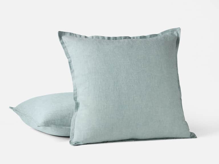
Shams help bridge the large plane of the duvet and the smaller details of the room. They can repeat a color from the cover, echo its texture, or introduce a stripe at a different scale. The Libeco Tahoe Stripe Pillow Sham, made from washed 100% linen, offers one example of how a striped accent can bring pattern and texture into a bedding arrangement. Its care guidance recommends washing with mild detergent and ironing while slightly damp if a smoother finish is desired.
Because shams sit upright at the head of the bed, their pattern is often more visible than that of a sheet. They can provide the room’s clearest decorative note without requiring the duvet itself to be elaborate. If the duvet has a strong stripe, consider a solid sham or one with a subtle finish. If the cover is understated, a striped sham can give the head of the bed definition.
Then comes the final layer: a coverlet or throw. Its purpose may be warmth, visual punctuation, or both. Folded across the foot of the bed, it creates a horizontal line that breaks up the duvet’s broad surface. Draped loosely over one corner, it can make the arrangement feel less exact. The scale matters. A heavy blanket can overwhelm light linen; a fine cotton layer is more likely to preserve its airy quality.
A pattern needs room to breathe
Pattern coordination is often reduced to the instruction not to mix patterns. The advice is cautious, but unnecessarily so. Stripes can coexist with checks, small motifs, or plain textures when their scale and intensity are considered. The difficulty arises when each pattern demands the same amount of attention.
A large stripe usually benefits from smaller, quieter companions. A fine stripe can sit comfortably beside a broader, more irregular texture. Patterns in related colors tend to feel connected even when their forms differ; patterns with strong contrast need more space between them. These are not rules so much as ways to make a decision before a room begins to feel crowded.
For a Libeco duvet cover with a visible stripe, one useful approach is to treat the cover as the principal pattern and allow the remaining bedding to play supporting roles. Choose shams in a related color, then add a throw with a clearly different texture rather than another stripe of similar scale. Alternatively, keep the duvet plain and let striped shams supply the pattern. Both arrangements can feel finished; the choice depends on how much movement the room can bear.
It also helps to notice the patterns already present outside the bed. A rug, curtain, or upholstered chair may contain the strongest motif in the room. The bedding does not need to repeat it. Color can make a connection where pattern would make a contest. A muted blue in the duvet, for instance, might pick up a tone in a rug without duplicating its design.
Drape, ease, and the lived-in bed
The way a duvet cover falls may seem like a minor matter until it is placed on a bed. A more structured fabric can hold a neat outline; a softer, more relaxed linen may settle into folds. That drape affects the room’s character. Smooth edges and carefully arranged corners suggest formality. A little movement suggests ease.
Neither appearance should be mistaken for a measure of care. A relaxed bed is not necessarily a neglected one, and a neatly made bed need not feel stiff. The useful aim is to decide how much order the room wants. A guest room may benefit from a more composed finish, with the duvet centered and the shams arranged evenly. In a bedroom used every day, a slight asymmetry can make the bed feel welcoming rather than staged.
Natural linen tends to soften with use and laundering, although how quickly and to what degree depends on the cloth and its care. That gradual change is part of its character. Instead of expecting a duvet cover to retain a newly purchased appearance indefinitely, it may be more helpful to think of the fabric as developing a familiar hand. Softness, creasing, and a subtle lived-in quality are not necessarily defects; they are among the reasons linen suits a room meant for rest.
Still, an easygoing look benefits from sensible care. Follow the instructions supplied with the specific cover, since linen constructions and finishes can differ. Avoid overcrowding the washer, use an appropriate mild detergent when recommended, and be attentive to drying guidance. Line drying can reduce mechanical wear, while a low or moderate dryer setting may be appropriate for some fabrics. If ironing is desired, slightly damp linen is generally easier to smooth than cloth that is completely dry. The label, rather than a universal rule, should have the final word.
Seasonal layers without a seasonal overhaul
A well-chosen duvet cover can remain in place as the weather changes. What shifts is the supporting cast. In warmer months, a breathable sheet and a lighter top layer may be enough. When the air turns cool, add a blanket or coverlet rather than replacing every textile on the bed. This is one advantage of a layered arrangement: comfort can be adjusted in small increments.
The duvet itself remains central, but the cover’s texture influences how the bed feels and looks in every season. Linen is often valued for its breathability and moisture management, while its natural texture gives a room a grounded quality that works beyond summer. In colder weather, a woven throw at the foot of the bed adds both warmth and contrast; in warmer weather, the same layer can be removed or folded away.
Seasonal changes need not mean a full change of palette. A bedroom can move from summer to winter through weight and arrangement rather than color. A pale linen duvet can be paired with a heavier blanket when temperatures drop. A darker cover can feel lighter in warm months when balanced with crisp sheets and fewer layers. Small adjustments keep the room coherent and make the bed easier to live with.
A few decisions before you make the bed
Before settling on a duvet cover, consider the room as it is, not as an imagined collection of matching objects. Look at the color of the walls, the finish of the floor, and the quality of daylight. Decide whether the bed should blend into the room or become its focal point. Then consider how much pattern is already present and what kind of surface would offer a useful contrast.
- Start with the mood. A solid, muted linen tends to produce a quieter impression; a stripe adds direction and a more defined rhythm.
- Compare surfaces. Pair a textured duvet cover with sheets or layers that either contrast clearly or recede. Avoid adding several nearly identical textures without a reason.
- Think about scale. If the duvet pattern is broad or prominent, keep nearby patterns smaller or simpler. If the cover is plain, a sham can introduce a modest accent.
- Consider daily use. A bedroom should be comfortable to maintain. Choose layers that can be laundered and handled according to their care instructions.
- Allow some imperfection. Linen’s relaxed drape is part of its appeal. The goal is not a bed that appears untouched, but one that feels considered and ready to use.
These choices may sound deliberate, but the finished effect should not. The best layered bedding rarely announces the labor behind it. It gives the eye a place to pause, lets the hand register the difference between cloths, and leaves enough room for the bed to be used without ceremony.
The quiet architecture of a bed
A duvet cover is a large, practical object, but it also has something of an architectural role. It establishes a broad plane, sets the bed’s visual weight, and links the mattress to the smaller pieces gathered around it. Linen makes that structure feel less formal. Its texture gives the surface character; its folds soften the geometry of the mattress; a stripe can introduce a measured line without turning the bed into a graphic exercise.
That balance—between structure and ease—is what makes Libeco duvet covers useful in layered bedrooms. A natural weave can bring depth to a restrained palette, while a subtle stripe offers pattern with a light touch. Coordinated sheets and shams can carry the arrangement forward, and a seasonal blanket can change the bed’s warmth without changing its underlying character.
In the end, layering is not a contest to see how many textiles a bed can hold. It is a way of choosing which differences are worth noticing: smooth beside nubby, plain beside striped, a cool sheet under a softer cover, a straight edge interrupted by a loose fold. When those contrasts are kept in proportion, the room feels composed but not overmanaged. The duvet cover does its work without asking for applause, which is perhaps the most useful kind of design.